Responsive Web Design Fundamentals

Frontend Engineer at ThinkLink
Introduction
The World Wide Web(WWW) opened the gates of creativity via the internet to everyone, not just scientists. It connected the world in a way that greatly facilitated people's access to knowledge, sharing, and communication. Since then, it has enabled individuals to share their ideas and work via social networking sites, blogs, video sharing, and more. In the beginning, people just used desktop computers. Thus, designing websites for screens of the same size was not much of a challenge. The advent of smartphones is what brought attention to designing for varying-sized displays. Today, the web is available on desktops, laptops, tablets, foldable phones, fridges, and cars. People rightly expect websites to look good no matter what device they're using. Responsive design allows websites to be designed in a way that they respond to the user's device and screen size. Now, let's dive deeper into understanding the fundamentals of responsive web design starting from the basics.
What is a pixel?
A pixel is the smallest unit of media such as an image or a video on a digital display device.
A pixel isn’t always a pixel

Yes, you read that right!
Consider an example,
#container {
    width: 800px;
}
Before high-density displays came out developers (designers too) were happy because, 1 CSS pixel = 1 hardware pixel, so those 800px of #container were mapped to 800 screen pixels. Now that high-density displays are a thing, there’s a new parameter to consider — the pixel ratio — used as a multiplier to determine how many hardware pixels map to a single CSS pixel.
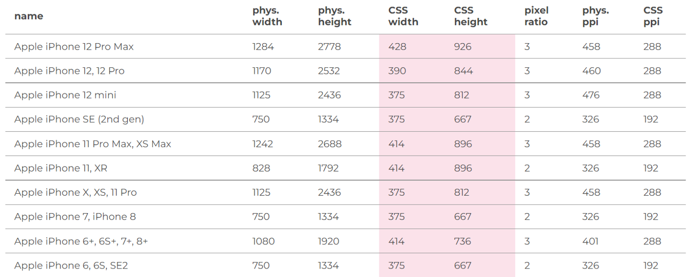
Check this out yourself at https://www.mydevice.io/
Hence for the Apple iPhone 12 Pro Max, this 428 px (DIP) gets scaled up to 1284 px when any media is rendered on display.
So the basic math is,
CSS pixel = ( Hardware Pixel / Device Pixel Ratio )
Thus, always look out for Device Independent Pixels (DIP) or CSS pixels over the standard Hardware Pixels or Physical Pixels.
What is a viewport?
When it comes to Responsive Web Designing, it is very likely to come across the term “viewport”. The browser viewport is the area of the window where web content is displayed.
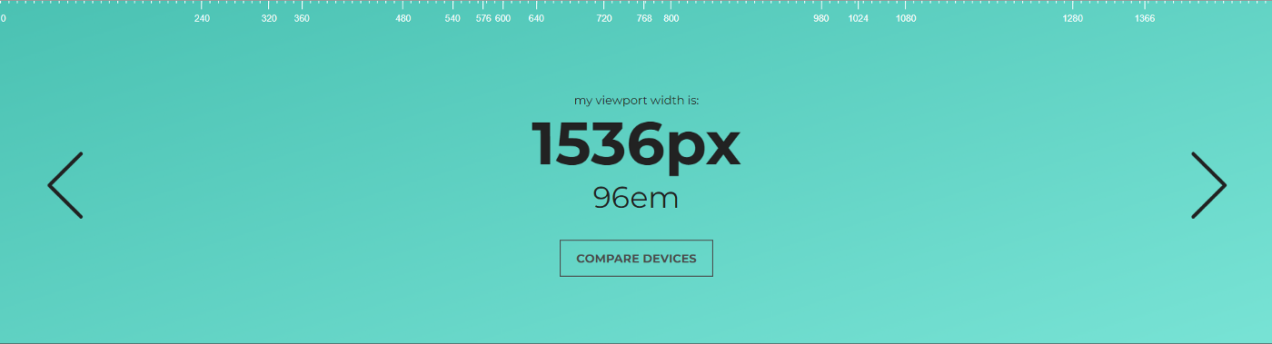
Note that my laptop has a screen resolution of 1920 x 1080 px. In simple terms, 1920px is the physical width whereas the number in the above image 1536px is the actual viewport width or CSS width.
Use meta element for the viewport
When rendering a webpage, the browser is completely unaware of the approach a developer adopted. The browser doesn’t know if the website was built for a desktop device or a mobile device. It simply renders the content in 980px in dimensions, which is not ideal.
The browser uses font-boosting to pick the primary content on the webpage and scale it up. And, browser taking the control over rendering the content is not something you want!
Meta element to the rescue!
<meta name="viewport" content="width=device-width, initial-scale=1">
The <meta> tag is to be added to the <head> tag in an HTML document. Majorly, the <meta> element emphasizes the content attribute for responsiveness. There are two values, separated by a comma. The width=device-width tells the browser to assume the width of the website to be the same as that of the device on which the user is currently viewing. Thus, refraining the browser from the 980px assumption. The initial-scale=1 in the content attribute is meant for scaling the content on the webpage. By setting it to 1, we are telling the browser not to do any scaling at all!
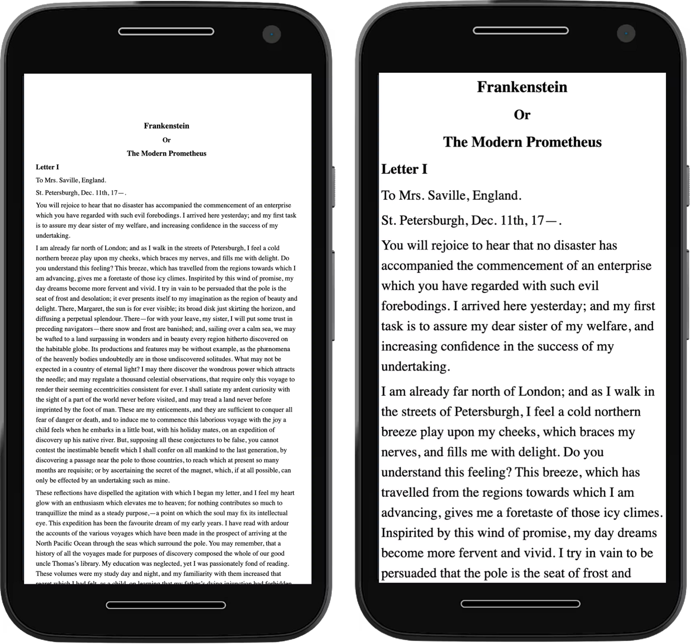
In the above image, the phone on the left shows how the layout looks before the meta tag is in place compared to the layout on the right.
Use max-width on elements
Add these to your main.css file.
img, embed, object, video {
    max-width: 100%
}
max-width overrides the width CSS property on a HTML element.
Tap-Targets
Areas on the webpage using which a user can carry out interactions are known as Tap-Targets. Buttons, links, and forms are perfect examples of tap-targets.
Tap targets should at least be 48 x 48 px in dimensions and spacing 40px between any two tap targets to ensure a good user experience. Anything less than 40px might result in the user clicking on both the targets together which is leading to a bad UX.
Use media-queries
Media-query is a place where all the magic happens!
Anatomy of a media query

Now, the CSS inside this media query is served to all the screens with viewport width in the range of 320 to 768px.
Media queries can be a very effective tool to add responsiveness to your website. The queries consisting of media features paired along with an operator (AND, OR, NOT) could cater to all the screens in that specific range— thus styling for multiple devices is possible using appropriate media queries.
min-width & min-height are the commonly used media features, especially to form ranges over viewport dimensions, but there are many more media features categories viz. Viewport, Display Quality, Color, Interaction, etc.
The anatomy has screen as the media type, and hence the query matches all the devices with a screen. There are several other media types such as — all to match all devices, print to match content in a print preview & speech to match devices that read content audibly, such as a screenreader.
Tip: Avoid using min-device-width & max-device-width in media-queries.
Why you would ask?
min-device-width & max-device-width, these CSS properties are based on the device width or the screen width. Thus, on resizing the browser window on your device, the CSS style in media-query doesn’t create any effect.
CSS Media Query Breakpoints
We shouldn't choose breakpoints at all. Instead, we should find them, using our content as a guide
— Scott Yale
Keeping in mind the number of different browsers, different devices, and different user preferences, it is next to impossible to design for every device out there. There are some common CSS breakpoints, but you cannot rely on them — as they might not always be a good fit for your design. Rather your content is the best guide to identifying the breakpoints in your layout. To do this, gradually narrow your desktop browser window and then observe the dimensions where your content breaks. The breakpoints now obtained are the natural breakpoints of your content. Now, these breakpoints could be used in writing the necessary media query — to achieve the desired layout or style on your website. As long as the design flows well at each browser width, it is very likely that it should work pretty reliably on any screen size.
Optimizations
<picture> element
<picture>

  <!-- Use this image if the screen is at least 768px wide -->
  <source srcset="husky-landscape.png" media="(min-width: 768px)">

  <!-- Use this image if the screen is at least 320px wide -->
  <source srcset="husky-cropped.png" media="(min-width: 320px)">

  <!-- Use this image if nothing matches -->
  <img src="husky.png" alt="A siberian husky in the snow.">

</picture>
We can use media queries on the <source> element. Thus, informing the <picture> element what version of an image the browser should render from a set of images.
By doing this, we can smartly improve the performance by only serving smaller images to smaller devices — which in most cases will be low-powered devices that might have some data constraints. This saves bandwidth as the browser won’t download the larger images unless they’re required.
Fonts
To ensure readability, make sure the font-size is at least 16px. Anything less than 16px, the user will end up in a tedious cycle of zoom-in and zoom-out, and eventually leaving your site. In addition to it, try sticking to 45–90 characters (including spaces) per line. 65 is an ideal count. Shorter lines are more comfortable for the reader than longer lines. Anything above 90 characters, and your eye has to travel farther from the end of one line to the beginning of the next, making it difficult to track your progress vertically on the screen.
Autocomplete
The task of filling out forms is tedious. Adding the autocomplete attribute could benefit the users in filling out the forms automatically. The autocomplete attribute provides a variety of options for improving contact forms, log-in forms, and checkout forms.
<label for="name">Name</label>
<input type="text" id="name" autocomplete="name">
Conclusion
The concepts discussed were just the tip of the iceberg because there is always more to learn and even more depth to all the specifics. It is advised to get your hands dirty when sizing tap targets, examining breakpoints, planning media queries, and writing CSS.
Applying your learnings is most important and often overlooked. So, after learning the fundamentals of responsive web design, I made a social-media app wherein I've tried catering to different-sized devices. Live: https://jurassic-world.netlify.app GitHub Repo: https://github.com/MarkVed17/jurassic-world
Until then, keep learning! keep growing! 😎
Let's connect on LinkedIn & Twitter.
Learn more
- https://www.udacity.com/course/responsive-web-design-fundamentals--ud893
- https://web.dev/learn/design/
If you found this blog helpful, you should definitely give these one's a read.